
“I’d like to believe that trends are always for the best and push everybody in the industry to step forward and make even better products. For instance, responsive web design started as a trend and in a short time it has become a necessary part of the design process.” – Claudio Guglieri, art director at B-Reel, NYC.
I can’t think of a better company to showcase in this week’s post, than TOMS – a company that truly embodies the idea of “responsive”. TOMS is in the business of giving. In response to children needing shoes in Argentina, Blake Mycoskie launched what would become the first high-profile “philanthropic capitalism” company.
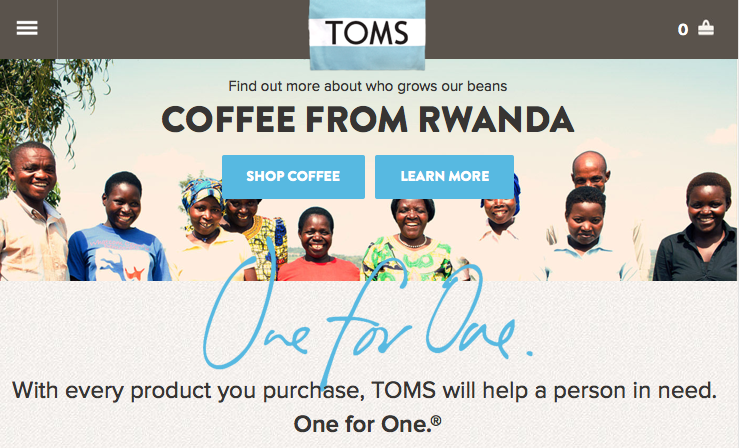
The TOMS.com website features responsive layout that changes based on the screen width of the device. Using a grid layout creates a consistent clean experience, no matter what the device.
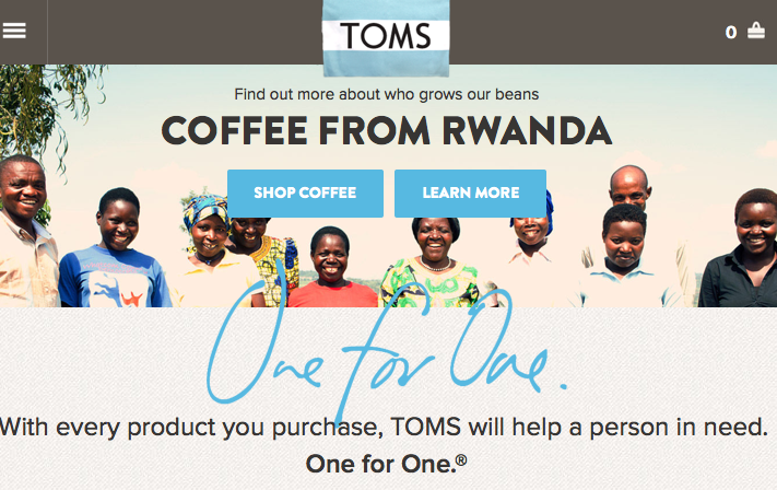
Desktop version / 960px breakpoint:
Top navigation is visible
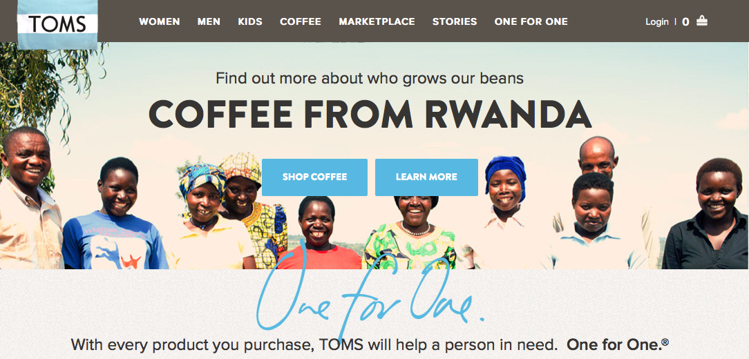
Vertical iPad Version / 720px breakpoint:
Top Navigation is hidden under menu icon on top right
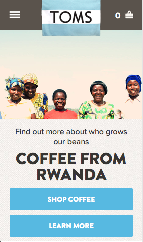
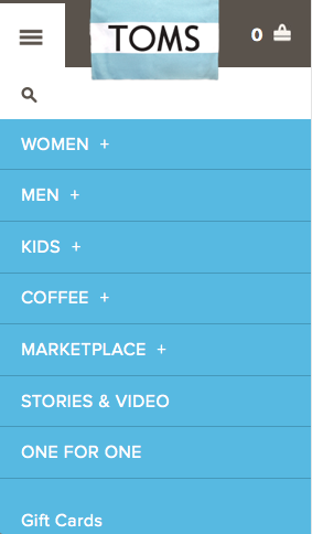
iPhone Version / 420px breakpoint:
Message is enlarged and draws attention to the action buttons
Navigation on iPhone Version:
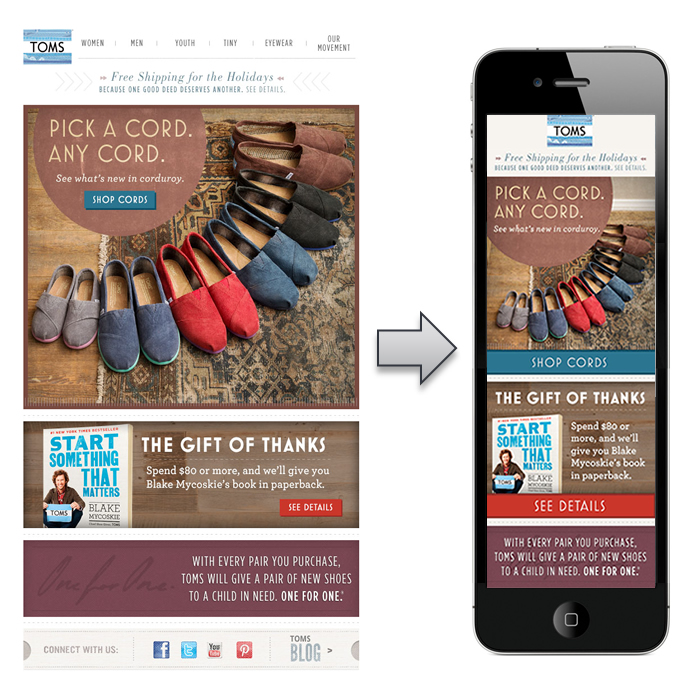
For eblasts, TOMS creates two versions of its email, one 600px wide and the other 320px, and uses media queries to display the correct version depending on the device.
TOMS’ use of responsive design is mission critical to deliver easy access to content for a variety of website visitors. It will be interesting to see what additional trends they incorporate into their digital marketing.


Fantastic! I honestly didn’t know much about responsive design until recently, but it makes so much sense. I think that companies who are not paying attention to this are really missing out on a huge window of opportunity. Great post!
Hi Sarah!
I think we can all learn a lot from brands like TOMS, both in their approach to marketing and the functionality of their tactics.
[…] design is critical to deliver easy access to content for a variety of website visitors. Fellow blogger Kristi gives a great example of how TOMs is using responsive design […]